More than 88% of consumers are less likely to revisit a website after a bad experience. Additionally, 75% of users say they make judgments about a company’s credibility based on their website design.
To create a positive perception of your brand, attract new business, and turn first-time buyers into loyal customers, your homepage should be top-notch.
If it isn’t attractive and user-friendly, your homepage can quickly become the reason why prospects choose your competitors over you.
Are you looking to craft the ultimate homepage? You’ve come to the right place! In this article, we’ll discuss 10 steps to design a standout homepage.
1. Use Compelling Headings and Subheadings
When a visitor is on your homepage, they need to know what your business offers within the first few seconds.
So, you need to quickly communicate your offerings.
You can use your headline and subheadings to clarify this and ensure that your message is delivered fast. Think of your headline as an extension of your slogan, only adapted to a different channel.
Here is an example of a good headline from Trello:
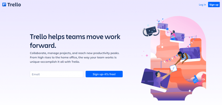
As you can see, the headline is specific enough that you understand what kind of service the platform provides, but it’s also impactful.
They wouldn’t be able to achieve the same effect by simply stating, “Trello helps you organize tasks.”
To describe what your product or service does more specifically, you can use subheadings.
In two short sentences, you can explain some of the key features of your product without being overly ‘salesy’ in your subheadings.
Just like the headline, the subheading in the example above works well. It gives you a glimpse of what you can expect from the tool and makes you want to scroll further and learn more.
2. Personalize Your Website Content
Currently, 80% of consumers are more likely to buy from brands that offer personalized website experiences. This means that personalizing your website should be your top priority if you want to drive more conversions.
You can personalize the content on your homepage so that each visitor receives a tailored experience. When your users are greeted with personalized messages, they will likely have a more positive response to your offerings.
Using data you’ve collected about your target audience, you can personalize these aspects of your homepage:
➡️ Customers’ names
Using customers’ names on your homepage may seem simple, but it can significantly improve their perception of your brand.
People love to see their own names. Scientific studies have found that certain parts of our brains activate when we see or hear our names compared to those of others.
➡️ Company names
If your brand is in the business-to-business (B2B) industry, you can include the name of your visitors’ company on your personalized homepage.
You can also mention that your solution can help businesses like theirs.
➡️ Location
By leveraging your visitors’ location data, you can tailor your homepage to display content relevant to their specific location.
For example, they won’t get recommendations for products that aren’t available in their country.
➡️ Other data
Customers’ emails, website screenshots, company logos, and even profile pictures can all be used to create a more personalized experience. All you need is a tool that can help you to do this.
We use his name, company name, website screenshots, website URL, and even the company logo to make one of the most customized home pages you’ll ever see.
3. Use Calls to Action (CTAs) That Convert
Your homepage shouldn’t be just an introduction to your business and products. It should also have strong calls-to-action that guide your visitors and increase the chance of conversions.
It should always be clear to your website visitors where they should go if they want to make a purchase or engage with your business.
There are two types of CTAs that you can use on your homepage:
- A primary call to action: These CTAs guide visitors further down your sales funnel, bringing them closer to purchasing by offering a clear path for action based on their current stage. Common primary CTAs include prompts like “Sign Up,” “Register,” or “Start Free Trial.”
- A secondary call to action: Secondary CTAs are for visitors who aren’t yet ready to make a purchase. Instead, these calls to action provide an alternative path and usually read something like “Explore Our Products” or “Learn More.”
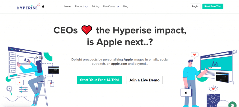
In the example below from Airfocus, “Start Free Trial” is a primary call to action while “How It Works” is their secondary CTA:
These CTAs are clear and provide enough information for visitors to take the next step.
Combining these two types of calls to action on your homepage gives your users multiple paths toward conversions.
4. Personalize Your Offer
Another effective homepage strategy is to personalize the offer that each user receives.
Like many personalization techniques, customizing your offer starts with gathering data. You need to know who is visiting your website, which customers are interested in specific products, and where each visitor is in the sales funnel.
The first thing you can do is use tools like Google Analytics to see your visitor demographics.
This data helps you identify visitor demographics and their product or service preferences, enabling you to customize your homepage. For example, you’d be able to show a 25-year-old man what he wants to see when he visits your site.
Secondly, you can have a sales funnel in place and provide tailored homepages to customers based on their stage in the funnel. For example, a customer discovering your brand shouldn’t get the same message as a long-time buyer checking out your latest offer.
Each customer can also get personalized recommendations on your homepage based on their past behavior.
Products they’ve already seen and content similar to what they’ve already viewed can all be incorporated into your homepage to give them a better experience.
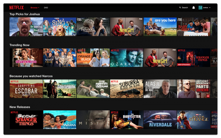
Netflix, Amazon, and many fashion eCommerce websites have used this level of personalization for years. As you can see below, Netflix has provided the user with personalized suggestions based on their previous behavior on the platform:
5. Follow Design Best Practices
Over 45% of consumers say that website design is the number one way they determine the credibility of a business. Additionally, 94% of first impressions of a website are design-related.
Adopting design best practices will help you create an excellent first impression and establish yourself as a credible brand.
Here are some design principles to consider when creating your homepage:
💡 Test your homepage with real users
You may think your homepage is great, but does the average consumer feel that way, too?
Expose your website to real users and conduct surveys and testing sessions to observe their interactions. You may gain invaluable insights.
You can use websites like Five Second Test to get feedback from real people who have seen your home page.
💡 Keep things simple
Even if you’re selling the most complicated products or services, your website should be easy to navigate. Everything should be clear and users should be guided to where they need to go.
Aside from using plain language that is easy to understand (not everyone will be accustomed to your products or services), your page design should be easy for the eye to follow.
For example, the human eye naturally reads from left to right. Placing your most important content on the left-hand side of your design is one way to simplify your homepage.
💡 Use white space
Despite its name, white space can be any color. It simply refers to the blank space between design elements that makes your content easier on the eyes. It also makes your CTA and other important elements more apparent.
💡 Implement a visual hierarchy
When visitors land on your homepage, they’ll often scan through it quickly. They won’t necessarily read every line of text.
This is why you need a visual hierarchy, which is the arrangement of elements that puts the most important information first.
💡 Use a relevant main image
Users typically spend six seconds looking at the main image on a website. Ensure that the focal design element is a large, relevant image that brings your homepage to life.
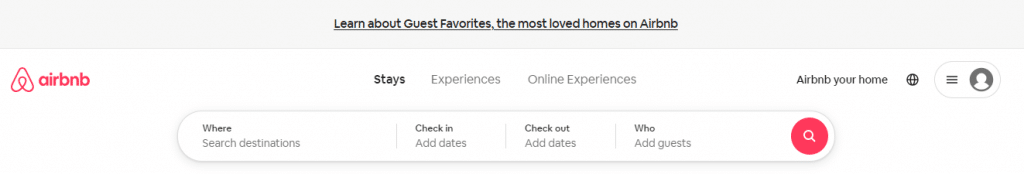
Airbnb clearly follows good design principles on its homepage:
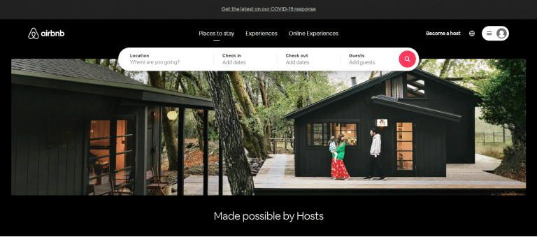
There is no clutter, and it’s clear what they want you to do next: enter your location and dates to view the available offers.
6. Optimize for Mobile Devices
Your website must look great on desktop, but does it perform well on mobile, too?
Over 80% of consumers expect websites to load in less than three seconds. However, the average mobile landing page takes seven seconds to load.
Your homepage design should be optimized for all devices. Half of all website visits come from mobile devices—a trend that has nearly doubled over the past five years. So, how do you design your website with these users in mind?
In mobile design, prioritizing page loading times is crucial. Since images, videos, and illustrations consume significant bandwidth, slowing down your website, it’s essential to optimize and compress these elements to ensure a swift, seamless user experience.
One of our favorite mobile homepage examples is from Etsy:
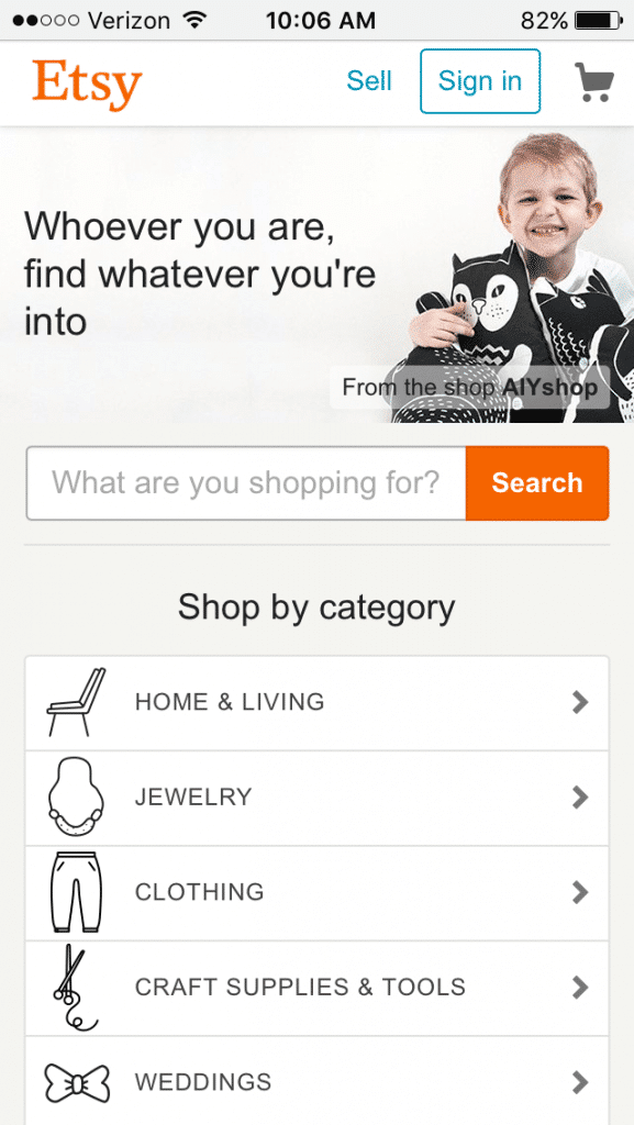
This mobile page is easy to navigate and perfectly suited for smartphones.
7. Make Navigation Easy
Almost 40% of users say poor navigation is one of the main reasons they leave websites.
While you want your homepage to look good and give each user a unique experience, proper navigation is arguably one of the most important features your website should have.
You can’t create a good homepage without making navigation easy and natural for visitors.
Effective navigation can be the deciding factor between a visitor leaving your site and achieving a conversion.
Your menu and categories should be clearly displayed and offer visitors an opportunity to find the section they want with minimum effort. This is especially important for complex eCommerce sites with several products and categories.
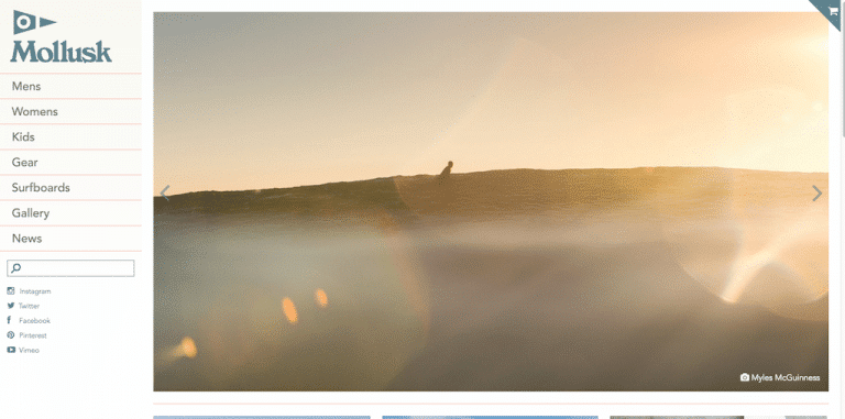
Here is an example of a well-structured homepage by Mollusk that looks good but also makes navigation easy:
8. Consider Adding a Search Engine Function
You may want to consider joining the ranks of some of the best homepages on the web by including a search bar on this page.
This is especially true if you’re running an eCommerce business that has multiple products and categories.
Take the Airbnb example from earlier. They’ve included a destination and date search form on their home page to make it easy for users to find the accommodation they’re looking for:
 >
>
Google and Bing aren’t the only search engines to consider. Turning your homepage into a search engine makes it easier for users to find what they want on your website.
9. Keep Your Copy Simple
You may be tempted to include as many words as possible on your homepage. However, it’s important to remember that consumers don’t have time to scroll through large walls of text.
Instead, use your homepage to list a few key benefits of your product or service rather than give visitors your entire sales pitch.
There’s also much debate about how short or long homepages should be. If you’re going with a longer option, ensure that all your copy is easy for the reader to digest and is skimmable for those who don’t have time to read each word.
Here’s an example from Golde that displays homepage copy that is easy to follow:
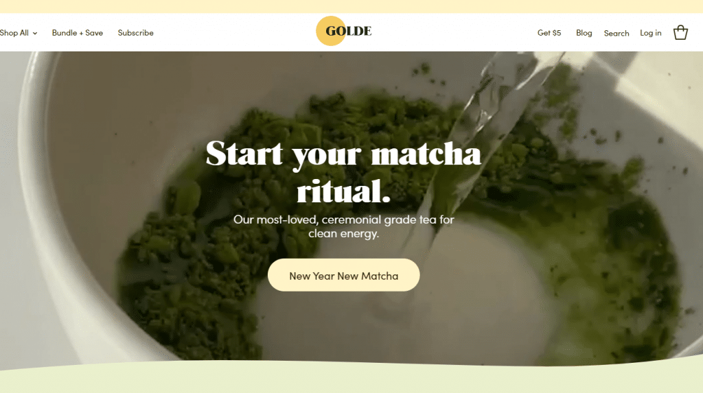
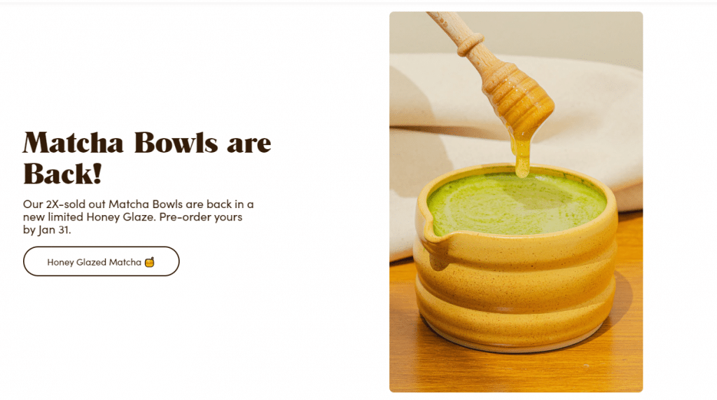
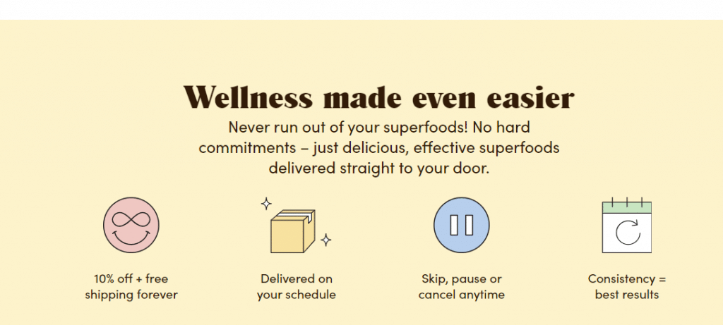
As you can see, the brand uses headings and icons to make its text skimmable. They also use short sentences to make their copy easy to understand.
10. Include Client Logos
If you’ve worked with any major brands or have been mentioned in the press, it’s a good idea to mention this on your homepage.
A homepage that includes news outlet logos and the brands you’ve worked with helps to establish trust and credibility in the eyes of your visitors.
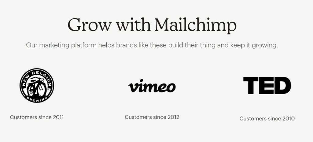
Mailchimp’s website is a great example of displaying logos on your homepage:
Create the Best Homepage Ever with Hyperise
Now that you know what the foundations of a good homepage are, it’s time to start building (or updating) your website to earn the trust of your prospects.
Remember, your homepage is your first shot at creating a good first impression. It needs to be compelling, personalized, and optimized if you want to see results.
One of the most effective ways to craft a homepage that grabs visitors’ attention right away is to use personalization. And with the Hyperise toolkit, you can personalize several homepage elements.
From call-to-action buttons and headlines to videos and images, Hyperise lets you tailor your homepage based on who’s visiting your site.
Sign up for a free trial of Hyperise to test drive our personalization tool yourself. We guarantee you’ll quickly discover why our tool is essential for creating an outstanding homepage.
Last Updated on February 4, 2024