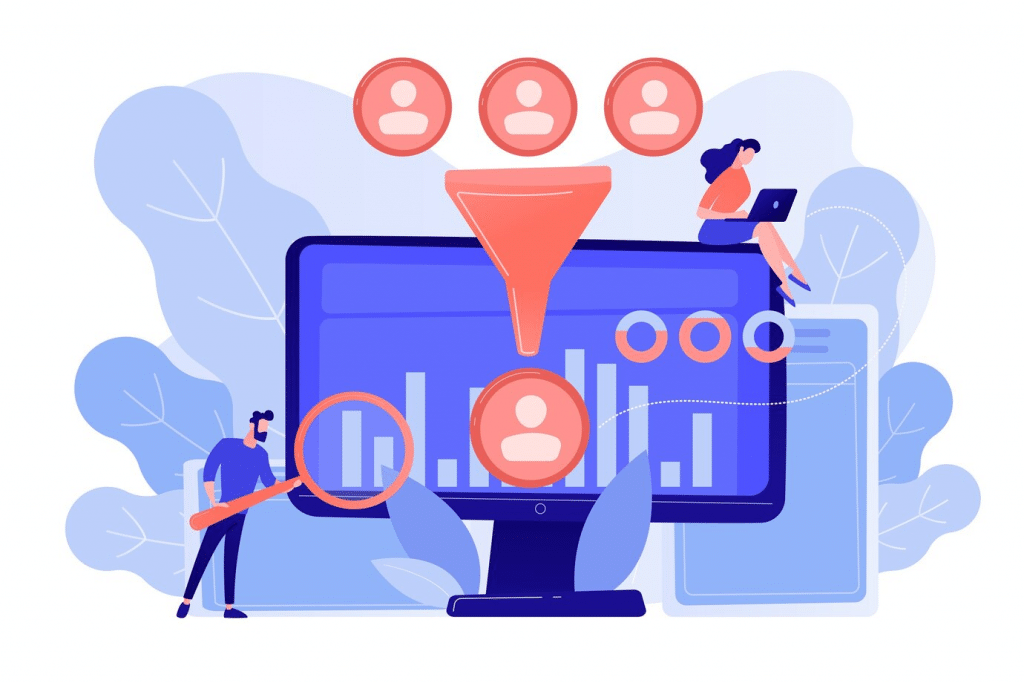
Welcome to the digital age, where the power of your online presence can make or break the success of your business.
At the heart of this digital frontier lies the landing page—your virtual handshake with potential customers. But not all handshakes are memorable.
In this article, we dive into the crucial elements that transform your landing page from just another web address into a conversion powerhouse.
From the psychological nuances of color and design to the compelling lure of masterful copywriting, we unpack the secrets to creating landing pages that don’t just attract visitors, but turn them into loyal customers.
Whether you’re a startup founder, a digital marketer, or simply looking to ramp up your online game, get ready for a journey into the art and science of landing page optimization. Let’s turn those clicks into conversions!
15 Key Elements to Include on a High-Converting Landing Page

What elements should you include to create landing pages that convert?
Find out below:
1. A compelling headline
Landing pages that convert have compelling headlines with clear, relevant information that empathizes with the audience’s problem.
Most importantly?
They encourage the reader to stay by avoiding tactics associated with clickbait and supplying relevant and useful information.
Some headline types with good engagement potential are:
💬 How-to headlines that clearly state benefits offered plus promise a solution
💬 Headlines that focus on your unique selling point
💬 Headlines that introduce an offer
💬 Headlines that use humor to pique interest
💬 Headlines with a pain-aware focus
This headline from BorderBuddy, for example, focuses on the audience’s pain point, then follows with a sub-headline that promises a solution:

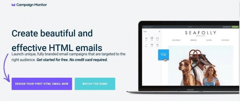
2. Contextual subheadings
Landing pages that convert contain subheadings that persuade the reader to read the content.
But how do you create such compelling subheadlines, or subheadings as they’re also referred to?
Ensure it contains persuasive language and offers more detail than the headline.
For example, Campaign Monitor uses a subheadline that complements the headline by stating the benefits to expect.
3. Benefits and features
The “Benefits and Features” section of a landing page plays a pivotal role in communicating the value of your product or service to potential customers.
Here’s a more detailed exploration:
➡️ Features: These are the specific characteristics of your product or service—what it includes, how it’s built, its technical aspects, etc. Features are factual statements about what the product is and what it does.
➡️ Benefits: Benefits explain why those features matter—they translate features into advantages for the user. Benefits address the user’s needs, desires, or problems and demonstrate how the product or service provides a solution.
Essentially, the Benefits and Features section should effectively bridge the gap between what your product/service does (features) and how it makes the user’s life better (benefits).
Calm, a meditation and sleep app does this very well:
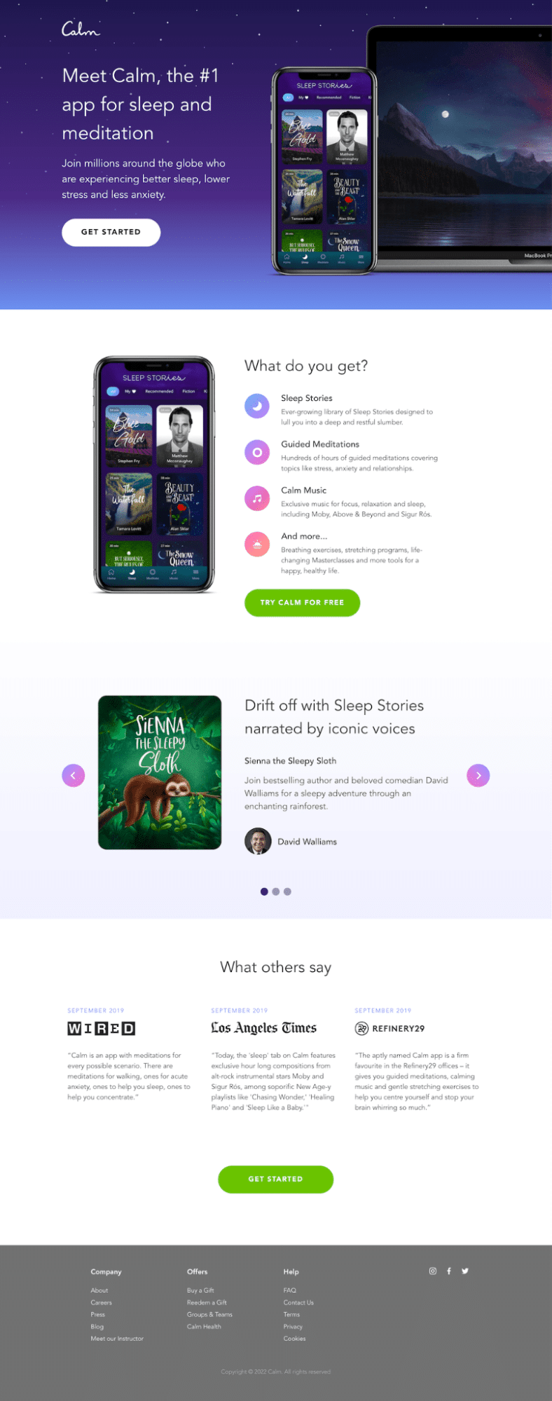
This landing page is designed to evoke a sense of tranquility.
It uses short, straightforward copy to avoid overwhelming visitors and clearly spells out its main benefits, being better sleep, lower stress, and less anxiety.
The page employs soothing colors and visuals to reinforce its theme of calmness.
4. Unique selling proposition (USP)
The unique selling proposition (USP) is a critical component of your landing page and overall marketing strategy. It’s what sets your product or service apart from competitors.
Basically, it should answer the question, “Why should a customer choose this over something else?”
A strong USP has the following characteristics:
➡️ It’s specific enough to provide a clear understanding of what makes your offer unique. Vague statements don’t create an impact.
➡️ It addresses the needs, problems, or desires of your target audience.
➡️ Focuses on the value or benefits rather than just the features of the product or service.
➡️ Easy to remember and concise, often encapsulated in a short, catchy phrase.
An example of a good USP on a landing page is Slack’s “Be Less Busy” landing page:
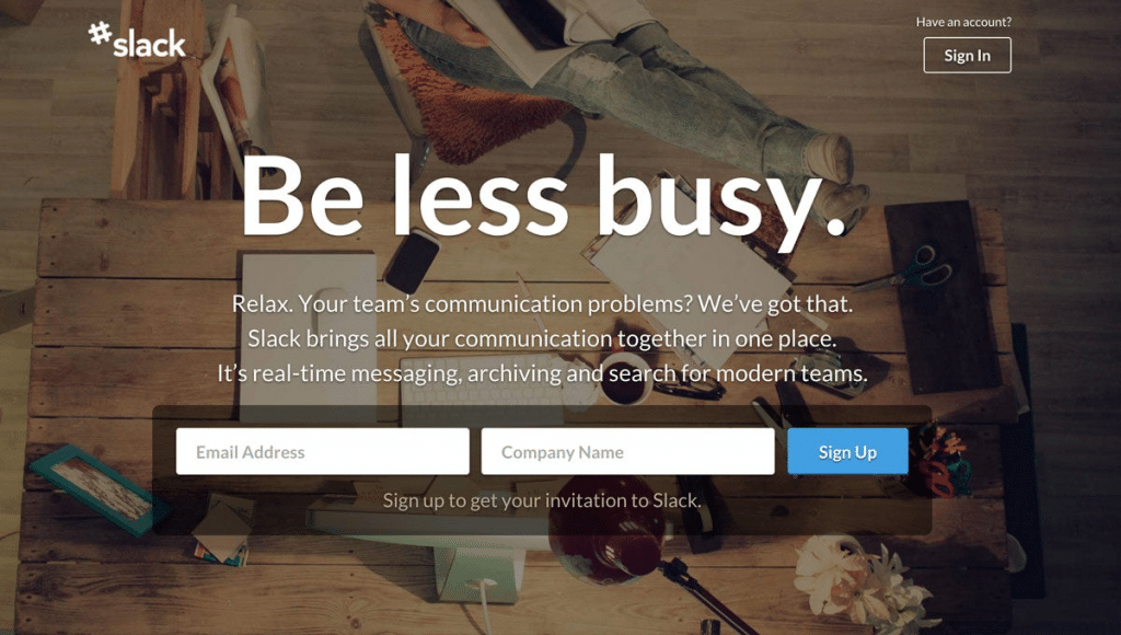
Slack is a group communication software. This USP clearly communicates what sets Slack apart and directly speaks to the user’s needs and desires. Their need is to be less busy by having a way to streamline communication and get their work done.
3. Impressive hero image
Landing pages that convert contain a hero shot that helps website visitors better understand the offer.
So, before using a stock photo for your landing page, ask yourself:
What do I want the image to say about my offer or product?
Will it resonate with the audience?
How will it make them feel?
The bottom line?
Ensure the hero shot makes customers emphasize with the issue at hand and picture themselves using your offer or product. It should also be relevant and match your messaging.
Secondly, ensure your hero shot loads fast by leveraging a compression tool like TinyImage that reduces the file size without ruining the quality. This way, visitors don’t wait long before the hero image loads.
A good example would be this hero shot from meowbox:
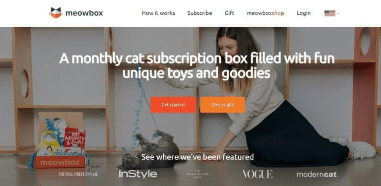
It shows a cat, the real customer, having a great time with one of the treats.
5. Quality visuals
When creating landing pages that convert, focus on showing, not telling.
What does this mean?
Besides the hero shot, leverage additional images that showcase context and grab the audience’s attention. They should be relevant to the offer and of high quality.
Most importantly, use images that showcase your products in use. Take images of your product from different angles, then enhance them with professional editing tools before you upload them.
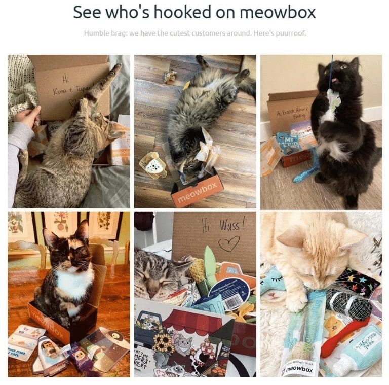
For example, in the meowbox example above, scrolling down the webpage brings you to incredible photos of real cats enjoying their meowbox treats.
They’ve leveraged images that show social proof, which will encourage other cat lovers to start a subscription with them.
6. Personalization
Landing pages that convert tend to connect with each reader on a personal level. They build upon data, including past behavior, geolocation, time, etc., to personalize experiences.
But how can you deliver personalization on landing pages?
As with all marketing efforts, start by researching your customer profiles and compiling rich data sets that include names, gender, behavior, company, geographic location, etc. Then, find a website personalization platform like Hyperise that helps deliver automated content on the fly.
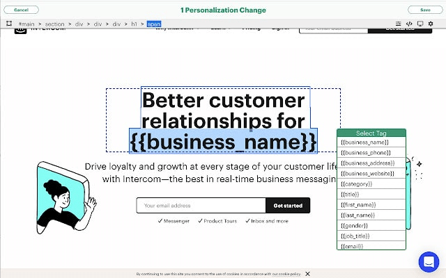
With these tools, you can now profile each audience based on the data, determine the content you wish to deliver to them, and create different landing pages for every audience segment.
What’s more?
Use dynamic content variations to personalize your landing pages, test different elements, and tailor them to each persona.
Ready to elevate your landing pages with a personal touch?
Discover the power of Hyperise and seamlessly integrate personalized images into your outreach tools and website.
Experience hyper-personalization at its finest and watch your engagement soar. Try Hyperise today and transform your landing pages into captivating, tailor-made experiences for every visitor.
Don’t just reach out—stand out. Click here to start your journey with Hyperise.
7. Engaging videos
According to research, 64% of people prefer to watch short videos to learn about products. 84% of them also say that watching a brand’s video convinced them to buy.
Therefore, it’s crucial to include videos when you’re aiming to create landing pages that convert.
And the best part about using video?
You can incorporate it in different ways on your landing page. Consider different types of videos such as explainer videos, demo videos, promo videos, or testimonial videos.
For example, replace your hero image with a video or leverage an animation creation tool to create a background video that draws attention to a headline, button, form, or text.
Alternatively, use videos as supporting assets or pop-ups that open when the viewer clicks on a thumbnail, button, or link.
Take, for example, this explainer landing page video from River Pools and Spas:
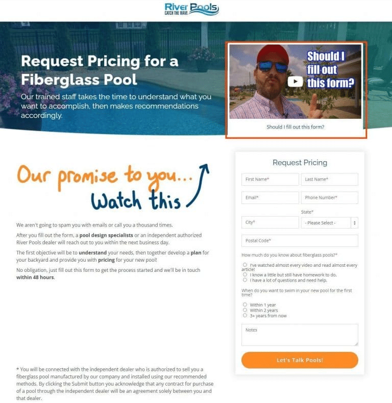
It convinces viewers to subscribe by promising them that they can expect only one email or one phone call once they’ve completed the form.
But what tips should you consider when including videos?
- Keep it short.
- Ensure the crucial message appears at the beginning of the video.
- Have an engaging thumbnail that entices viewers to click.
- Avoid auto-play videos; rather add a call to action that asks readers to click on it to watch. The video can then play without sound, which allows users the choice to unmute it when watching.
- Avoid landing pages that only contain a video. Landing pages that convert feature a video plus additional copy to give some context.
- Reduce video load times to avoid bounce rates and poor conversions.
- Optimize videos for search. Include captions with your main keywords, add XML Sitemaps, and include the necessary metadata to index your video.
8. Clear product/offer descriptions
Landing pages that convert clearly explain what the product or offer does, the pain point it helps alleviate, and the benefits of using it.
And guess what?
You can rely on your headings, testimonials, and images to convey all of this.
For example, have previous customers highlight pain references and how your product solved them in their video testimonials.
Their testimonial can also feature benefits, or showcase how the product met a particular emotional need.
9. Powerful calls to action
Calls to action (CTAs) turn your conversion goal into a reality. That’s why a CTA is an important element of a great landing page.
However, if you want your landing pages to convert, avoid cliché CTAs like “SUBMIT” or “CLICK HERE.”
Instead, focus on the visitor journey, your unique selling point, and what precisely it is that the visitor will get once they click. You can add a form link as a CTA button to get visitors’ responses. Online form builder tools can help you easily create automated forms for your landing pages.
Most importantly, you must have a clear call to action that tells the visitor exactly what you need them to do by using phrases that motivate them to act.
For example, you can leverage urgency phrases like “now,” “hurry,” or “offer ends,” or scarcity phrases like “exclusive,” “limited edition,” “biggest ever,” etc.
So, what are examples of phrases that can drive action on your landing pages?
Yes, I want X!
Gain Your X Now
Start Your Path to X or Begin Your Journey to X
Activate X Now!
Get Your X Now
Add to Cart
Reserve Your Spot
Get This Look
Note: X represents the benefit your audience will get.
In addition, you should also consider the color scheme of your page when creating a CTA. You should use a contrasting color for your CTA button to make it eye-catching. This will help you convert visitors faster.
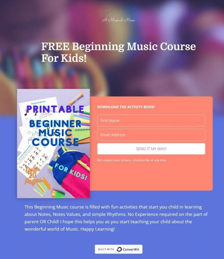
Take, for example, this CTA from A Music Mom that uses a creative action-oriented phrase to encourage clicks:
9. Contact information
Landing pages that convert contain contact information that showcases the legitimacy of your business. These can consist of a physical address, email, phone number, or contact forms. If you have access to chatbots, you may leverage them to deliver contextual information to readers in real time.
By including contact information or a chatbot on your landing page, you can eliminate—to some degree—the concerns a user might have about your legitimacy. This helps reduce potential hurdles that might prevent them from entering your sales funnel.
This page by Drift is one of the best landing page examples as it uses a chatbot to address user concerns on their RevGrowth Virtual Summit landing page.
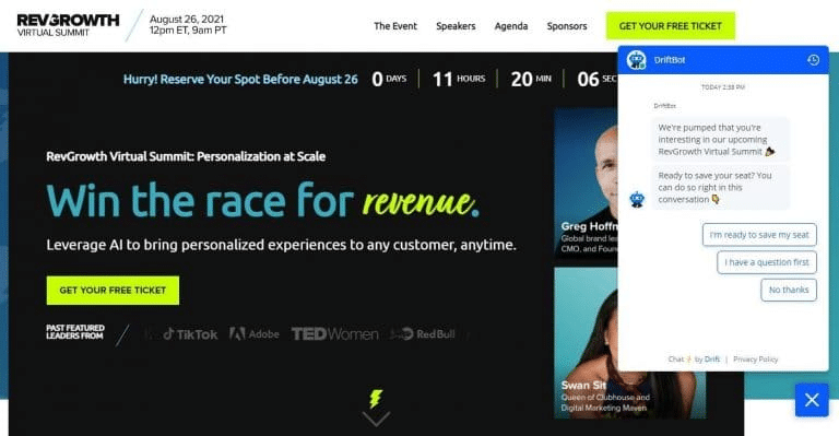
Including it ensures that anyone with questions about the event can get their worries waylaid before they book a seat. It also makes the registration process easier.
10. Lead capture form
A lead capture form is a vital element on a perfect landing page. It collects essential information like names, email addresses, and sometimes additional details like phone numbers or company names.
This information is used to generate leads, which then can be nurtured through email marketing, sales calls, or other marketing strategies.
Key features of an effective lead capture form include:
📄 Make it concise and only ask essential information.
🔍 Request only the data needed for your marketing or sales.
👀 Place it prominently on the landing page for easy access.
🎁 Offer something valuable like an e-book or discount as encouragement.
🔒 Reassure users of data security with a privacy statement.
💻 Responsive design—ensure the form works well on all devices, particularly mobiles.
✅ Have a distinct CTA button like “Sign Up” to prompt action.
A great landing page example of this is KlientBoost:
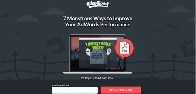
Their landing page features a very simple lead capture form, asking only for an email address.
This minimizes any resistance that site visitors may feel during the lead generation process. In exchange for just their email address, a landing page visitor gets a free 25-page resource on improving AdWords performance.
The page’s simplicity, fast loading speed, and clear call to action make it a high-converting landing page.
11. Clear product guarantees
What else can you do to reassure people on your landing page?
Give people a guarantee and place it as close as possible to your CTA.
For example, landing pages that convert use terms like money-back guarantee, 100% satisfaction, etc., or you can add trust badges that offer guarantees.
12. Inspiring social proof
According to research, consumers looking to buy online check reviews 89% of the time.
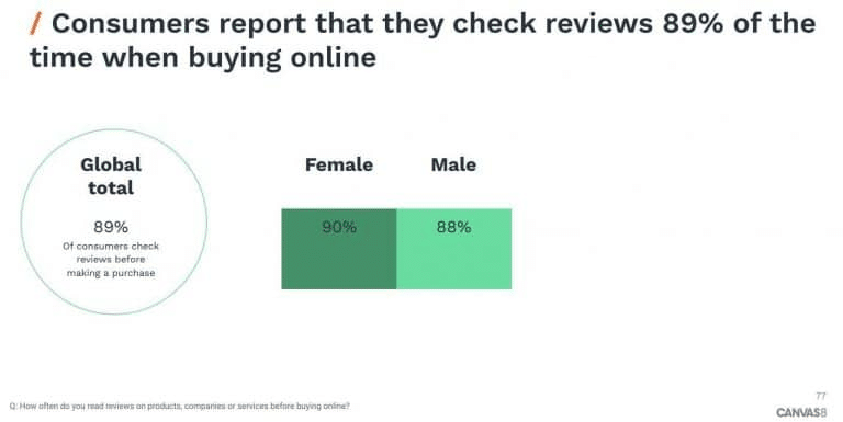
You therefore need to incorporate reviews in landing pages that convert.
Use them as social proof and as reassurance that other people who bought or subscribed to your product were glad that they did so. Additionally, you can feature suitable social media channels such as influencer marketing, content marketing, social marketing, email marketing, etc. on your landing pages for your digital marketing campaigns.
But what kind of social proof can you offer when creating landing pages that convert?
✔️ Customer reviews
✔️ Testimonials from experts
✔️ Awards
✔️ Trust seals
✔️ Indicating the number of customers who’ve bought your product
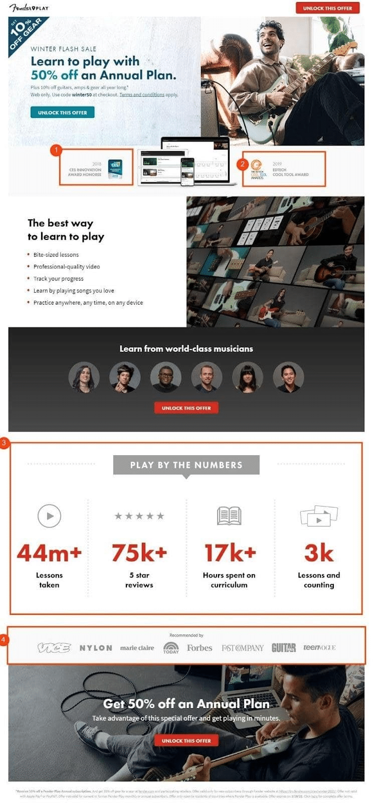
In the example below, music equipment company Fender Guitars provides different forms of social proof that are leveraged to reassure the customer that what they offer is legit:
13. Great branding
Effective branding is crucial for landing page success for several reasons:
🔸 Recognition and recall: Consistent branding helps visitors instantly recognize and remember your brand, fostering familiarity and trust.
🔸 Differentiation: Strong branding sets your offering apart from competitors, highlighting your unique value proposition.
🔸 Emotional connection: Well-executed branding emotionally resonates with your audience, influencing their decision-making process positively.
🔸 Professionalism and credibility: A well-branded landing page conveys professionalism and credibility, which are essential for building confidence in your products or services.
🔸 User experience: Consistent and appealing branding contributes to a positive user experience, encouraging visitors to engage more deeply with your content and calls to action.
Here are some branding best practices to boost landing page conversions:
✅ Keep logos, color schemes, typography, and imagery uniform across all platforms for strong brand recognition.
✅ Select colors that reflect your brand’s personality and influence user actions.
✅ Use legible fonts that embody your brand’s character and voice.
✅ Align visuals with your brand’s style and message.
✅ Match the landing page’s language with your brand’s tone.
✅ Include distinctive brand elements like mascots or slogans for better recognition and uniqueness.
Let’s refer back to Calm here. Their landing page is simple, with clean and straightforward copy under the headline “Meet Calm,” which instills a feeling of harmony and peace.
It uses soothing colors and visuals that depict a serene evening sky and soft blue shades to reinforce its branding and invite calmness.
14. FAQ section
An FAQ section on a landing page is great for quickly answering common questions, which helps build trust and makes the site easier to use.
It also saves both the visitor and the business time, and helps people make decisions faster by giving them the important information they need right away.
Best practices for an FAQ section
❓ Address questions that are genuinely frequently asked and relevant to your target audience.
❓ Keep the answers clear, concise, and to the point.
❓ If there are many similar questions, categorize them for easier navigation.
❓ For longer FAQ sections, include a search bar to help users quickly find what they’re looking for.
❓ Regularly update the FAQ section to reflect the most current information and questions.
❓ Ensure the FAQ section is easy to find and read, with a user-friendly interface.
A good example is Netflix:
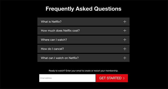
This FAQ section is designed to reduce friction in the sales funnel by addressing common concerns people looking to sign up for their streaming service may have. By simply clicking on the question they need answering, users are met with a concise answer.
15. Make an offer they can’t refuse
A landing page can be really helpful to people who visit it. But, there are so many other companies also vying for these potential customers’ attention.
Some folks might feel unsure about giving their email address. So, it’s important that a landing page offers them something good in return. That’s why lots of companies give a special deal just for sharing an email address.
They might also offer a discount, a free trial, or even free shipping as a bonus for signing up.
Take a look at the example of Brooklinen.
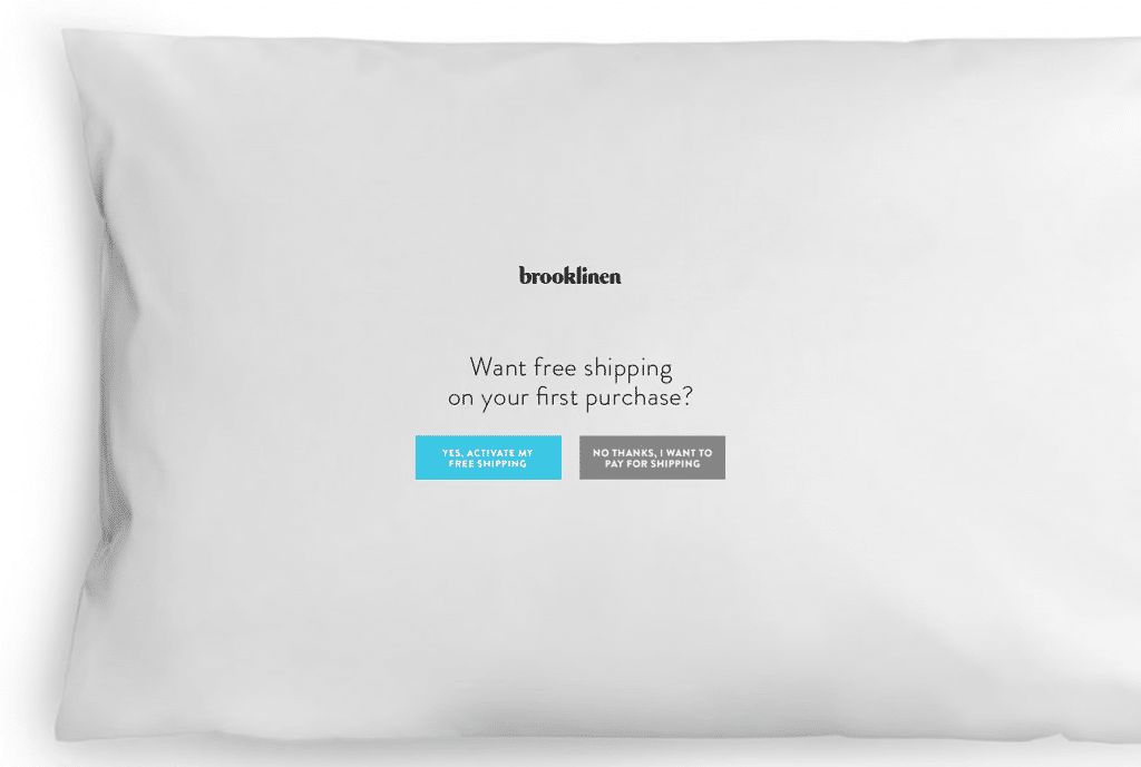
Brooklinen offers free shipping on the first buy when you sign up. If you don’t want to sign up, you have to click a button that says you’re okay with paying for shipping. Most people don’t want to pay extra for shipping, so it’s a clever way to get them to sign up.
Now that you know the landing page elements you need to create a good landing page, how can you increase your chances of conversion?
Let’s find out.
Tips to Create High-Converting Landing Pages
The following are best practices to follow when creating landing pages:
1. Choose the best landing page builders
For landing pages that convert, you need a builder that will help you meet your goals. It should also meet your company’s needs, pricing should be within your budget, and it must suit your skill level.
But what features make the best builders for landing pages?
Some of the basic ones offer the following features:
⚙️ Customizable
⚙️ Coding-free
⚙️ Numerous templates
⚙️ Ability to integrate different CTAs
⚙️ A/B testing functionalities
⚙️ In-depth analytics
⚙️ Ability to use custom domains
2. Make your content concise
The content you use on your landing page can either elevate or diminish user experience with your brand. When creating content, ask yourself the following questions:
🎉 Does it make them want to buy your product?
🎉 Does it clearly convey your value proposition?
🎉 Does it differentiate your brand?
🎉 Has it been optimized for SEO?
🎉 Does it explain how the product fits into the customer’s world?
🎉 Does it truly speak to the audience?
Sounds like a lot, right?
You can create successful landing pages that convert if you ensure your message is concise. Try and use as few words as possible to communicate your offer.
Secondly, ensure your content:
✔️ Is clear and speaks directly to your specific target audience
✔️ Supplies the most crucial details first
✔️ Includes features and benefits
✔️ Contains words your audience uses
✔️ Builds trust among your audience
✔️ Is easy to skim (bullet points, etc.)
✔️ Contains noncopy elements like graphics, white space, images, etc.
✔️ Has no passive voice
✔️ Incorporates strategies such as highlighting scarcity or urgency, and a clear CTA
✔️ Includes convincing numbers, percentages, or statistics
3. Work on mobile optimization
Optimizing landing pages for mobile use is increasingly important in today’s digital landscape. With over 50% of global website traffic now coming from mobile devices, ensuring that landing pages are mobile-friendly is no longer optional but necessary.
But how?
Here are some concise best practices for optimizing landing pages for mobile:
🏆 Responsive design: Ensure your landing page adjusts to different screen sizes and orientations.
🏆 Fast loading times: Optimize images and minimize code to ensure the page loads quickly on mobile devices.
🏆 Simplified layout: Use a clean, simple layout that’s easy to navigate on a smaller screen.
🏆 Large, easy-to-tap buttons: Make buttons large enough to be easily tapped on a mobile device.
🏆 Readable text: Use a font size that’s easy to read on mobile without having to zoom in.
🏆 Minimal input required: Keep how much text users need to enter as low as possible, as typing on a mobile device can be cumbersome.
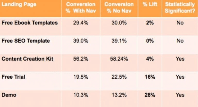
4. Avoid adding navigation elements
On-page navigation includes adding elements or links that lead visitors away from your landing page to other pages like your home page.
You may wonder if this isn’t a good idea, but good reasons for not adding them if you want landing pages that convert, include:
❌ They can cause high bounce rates
❌ They prevent the reader from focusing on one offer
❌ They can distract viewers
❌ They can waste your money
Think about it, if the viewer leaves the landing page without converting, then you’ve potentially wasted the money you had to spend to get them to click in the first place, even if they’re still on your home page or any other page on your website.
And, the most compelling reason not to add navigation elements?
Not using them can increase conversion rates, according to research:
5. A/B test your landing page design
How do you ascertain that you’ve created landing pages that convert?
Through A/B testing, you can test elements like fonts, CTAs, content, header, form size, etc.
It enables you to find out which elements work better than others. A/B testing can also help you know where you lose readers and what elements you can change to optimize conversion rates.
But how do you test?
Show visitors different versions of your landing page or leverage tools like heatmaps to see how visitors engage with your landing page. Then, use the data you’ve gathered to optimize it.
7. Leverage analytics from other platforms
It’s crucial to know where traffic from your landing pages comes from.
For this reason, one of the key ways to create landing pages that convert is to leverage analytics from other platforms, including social media analytics, Google Analytics, etc.
Why is this important?
Monitoring these analytics can help you understand which of your other paid and organic strategies helped you increase traffic to your landing page, that ultimately led to conversions.
For example, if you leverage analytics from Instagram or Facebook, you can discover which social network drove the most traffic to your landing page and learn how many people engaged with links directing to your landing page. You can also tell how many clicked to visit your website, the number of saves you got, etc.
In addition, you can leverage social media performance analytics on Google Analytics to reseach other popular landing pages and content types.
This information can then help you optimize your landing pages for more clicks and conversions.
Final Thoughts
Are your landing pages optimized for maximum conversion? If you’re finding that your current pages aren’t turning visitors into leads or customers, it’s time to harness the power of well-crafted landing pages.
By incorporating key elements that facilitate user engagement and ease of conversion, you can significantly elevate your brand’s reach, attract a wider audience, and enhance your conversion rates.
Make your landing pages stand out with Hyperise!
Elevate your website’s effectiveness by offering personalized content to each visitor. Hyperise provides a sophisticated yet user-friendly solution for website personalization.
Try it out today and discover how our tool can tailor your website to individual user needs, which greatly improves engagement and conversion rates.
Last Updated on July 3, 2025