It takes visitors as little as 0.5 seconds to form an opinion about your website. This gives you a very small window of opportunity to make a good first impression.
Developing and designing a top-notch website for your brand is vital if you want to build credibility, earn your prospects’ trust, and get referrals. Research shows that:
- 75% of users will judge a business’s credibility based on its website design.
- 57% of users say they won’t recommend a business with a poorly designed website.
- 89% of consumers will choose a competitor over you if they have a poor experience on your website.
As you can see, the quality of your website and the user experience (UX) you provide could make or break a sale.
In this article, we’ll discuss what you need to create a compelling website and achieve excellent results.
Why You Need Strong Website Branding
Before you roll up your sleeves and get to work on creating a beautiful website, you should understand why you need good branding across your site:
➡️ Create a good first impression
If you have less than a second to make a good first impression on your visitors, a strong brand identity is key.
Your brand identity refers to the visible elements of your brand, including your logo, design, and colors. Creating a beautiful logo is just the start but serves as the foundation for your brand. Using a logo maker can help you quickly create a professional logo that aligns with your brand’s vision.
The design of the brand identity must be concise and clear, highlighting the characteristics of the brand. The color matching is consistent with the company’s brand image and cultural values. Some comfortable, natural, and representative colors should be chosen. An AI brand identity generator can be a helpful tool in this process, offering guidance on visual choices that align with brand messaging.
In addition to online, many companies in real life also pay special attention to the choice of brand identity materials. For example, Custom Neon Signs are a beneficial display of your brand. Its unique design allows brand information to be conveyed quickly and attracts the attention of potential customers. Whether it is a high-end brand or a small store, you can show your characteristics and style through neon signs.
Maintaining a consistent use of brand identity throughout your website enhances your company’s image, resulting in a memorable first impression.
Professional brand identity begins with a strong logo that reflects your business. Utilizing a custom logo creator, businesses can efficiently design a unique logo at no cost and download it seamlessly. This can be an excellent asset in your brand toolkit.
➡️ Differentiate your brand from competitors
A distinct brand personality on your website sets you apart from the competition.
Strong, consistent branding that is easily recognized leaves a lasting impression, making it easier for your visitors to recall your business.
This increases the likelihood of them returning to your site instead of supporting your competitors.
➡️ Improve brand recognition
Your website is the perfect place to display your branding and cement your business in your prospects’ minds.
A brand identity that goes beyond the product or services you’re offering can help drive brand recall, which is how well your customers remember your business even after they’ve left your website.
To measure and optimize how your audience perceives your brand over time, you can use a brand tracking software like Tracksuit. These tools provide valuable insights into how your brand performs across channels, helping you make informed decisions to strengthen awareness and positioning.
Another way to build recognition is by tapping into the reach of your most loyal customers. Using a brand ambassador platform like BrandChamp, you can encourage brand advocates to share your message in an authentic, scalable way.
If you’re struggling with brand identity and development you could tty using a b2b website design agency who can help guide you in the right direction.
➡️ Drive customer retention and brand loyalty
Paying attention to how your customers’ website experience can help create a positive perception of your brand.
You’ll see the results of a good UX when one-time customers turn into loyal brand advocates.
➡️ Enhance professionalism
When your website branding is consistent across all your online channels, prospects will spot your business from a mile away.
Consistent branding also shows a great level of professionalism, which is important in winning your prospective customers’ trust.
A well-branded site that delivers consistent visual elements, messaging, and easy navigation contributes to a seamless, professional, and memorable journey for your visitors. Integrating AI technologies into branding processes is becoming an integral part of successful promotion. Creating unique content and ideas can be a challenge, but using tools like AI to generate topics can help make the process much easier. For example, you can generate topic with AI and get inspiration for your next branding project, improving creative solutions and engaging your audience.
8 Essentials for an Awesome Website
Now that you know why it’s important to convey a strong brand identity through your website, let’s look at the essential elements of a compelling site:
1. A clear objective
Before embarking on website and branding development, you should define your goals and objectives for your site.
Are you looking to generate more leads? Do you want visitors to buy products or services directly from your website?
Having a clear understanding of your website’s objectives can guide the design and branding choices you make.
Ask yourself the following questions to determine the overall objective of your website:
- Why are we building the website?
- What will set our website apart from competitors’ sites?
- What do we want our target audience to do once they visit our website?
Here are some examples of the types of goals you may have for your website:
- To answer commonly asked questions from your prospects.
- To position your product or service as the solution to your prospects’ pain points.
- Capture leads for your sales team.
- Collect email addresses for your database.
- Showcase customer testimonials and reviews to establish credibility and trust.
- Share product updates and company announcements to keep prospects informed. For example, dealership websites often focus on capturing leads and providing quick access to inventory, financing tools, and service booking options to enhance customer convenience and engagement.
Chocomize’s website is a good example of a strong objective. Their goal—to speak to businesses wanting to improve their brand—is clear from the moment you view their homepage:
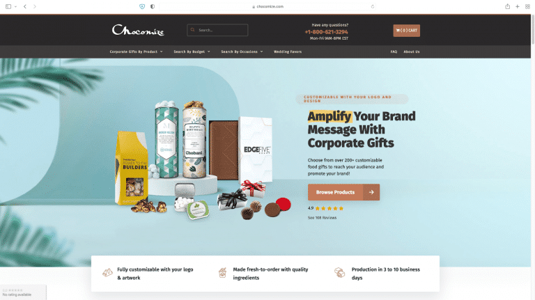
You know right away what they do, and you can search for products based on your preferences, budget, and occasion. There’s even a tab for a specific customer need: wedding favors.
Finally, their toll-free number is prominently displayed if you’d like to speak to a human.
2. A well-thought-out layout and structure
Now that you’ve outlined your website goals, it’s time to think about the structure and layout.
The structure of your website is important because it directly affects the prospects’ experience.
Here are the standard pages to include when you’re planning the structure of your website:
🌐 Homepage: Think of this page as the entrance of your website. The entire page should communicate what you do, who you are, and how your product or service can help. Check out our guide to creating the best homepage ever.
🌐 About: This page tells your brand story and highlights the people behind your business. This is also where you would communicate your brand values.
🌐 Product or service pages: If you have more than one product or service, you’ll want to develop separate pages for each offering.
🌐 Location information: If you have a physical store or office, visitors should be able to find your location details easily. You can add a map to this page, too.
🌐 Frequently asked questions (FAQs) page: Apart from answering commonly asked questions by customers, the FAQ page is a time-saver for your customer support team as they can direct prospects there for more information.
🌐 Policy page: Whether you’re a small business or a massive brand servicing several countries, you must have certain documentation, like a privacy policy.
🌐 Contact page:
This is where visitors can get in touch with you. Aside from your contact details, you can also add links to your social media platforms here so that people can visit your social profile if theey are manage well by some social media marketing company.
👉 The Human Behind Your Brand
When writing content for these website pages, always add a human touch to your copy.
This includes speaking directly to visitors and their pain points–-making them feel like your content was written for them specifically—rather than using high-level language to speak about your brand.
Website visitors want to know that there are real people behind your website.
 If you’re not sure where to start, platforms like Canva’s Website Builder make it simple to put together these essential pages with customizable templates. This way, you can focus more on the message and branding rather than technical hurdles.
Once you’ve got the structure of your site in place, you need to plan for the following website assets:
- A header.
- A footer.
- Navigation bars.
- Buttons.
- Fonts and typography.
- Visuals.
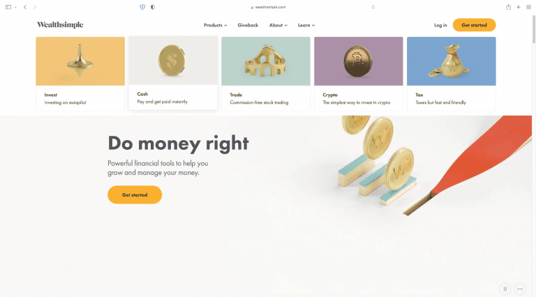
Take a look at Wealthsimple’s website structure and assets below. It’s a simple layout for an online investment management service—an industry known for its complexity:
3. Visual assets that pack a punch
Strong online branding helps promote brand recognition recall. For example, you know it’s Nike or Netflix just by looking at the logo.
You should aim to stay top-of-mind when it comes to your website graphics and marketing materials.
These include your site’s visual assets like logo design, infographics, videos, and high-quality photographs. A Photo gallery for website can also be a powerful way to showcase your brand’s personality, past projects, or customer experiences in a structured and visually engaging format.
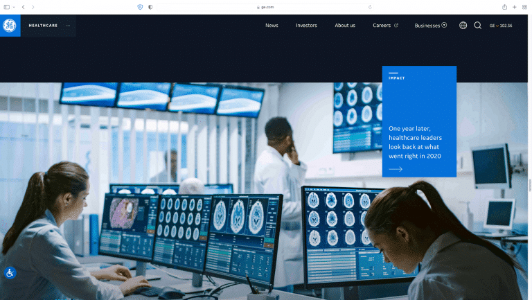
For example, General Electric’s homepage is filled with brilliant, high-quality images of their tagline: Building a world that works.
These photographs intentionally show website visitors what the brand represents even before they read the website content:
4. Strategic content
Strategic content is copy, videos, and visuals that are aligned with your business goals and the objective of your website.
Crafting strategic website content requires understanding your visitors’ needs and preferences, and tailoring content types to guide them through your sales funnel stages.
For example, if you’re looking to get the attention of CEOs and other key decision-makers in an organization, create thought-leadership content that offers frameworks to help them make better decisions.
Most of the time, this audience won’t be interested in tactics or actionable steps. This content may resonate more with mid-level managers.
A prime example of strategic content is Molecula.io, which effectively leverages data intelligence to deliver insightful and high-value resources for businesses seeking advanced analytics solutions.
Additionally, when creating your content, pay attention to the style, tone, and brand voice you use.
The benefit of well-thought-through content is twofold. It helps strengthen and differentiate your brand while ensuring that you develop content that genuinely resonates with your audience.
You might even consider working with a digital marketing agency like Seeker Digital to develop an ongoing content strategy that’s optimized for your target audience’s needs as well as educational and engaging — all elements which can help strengthen your brand.
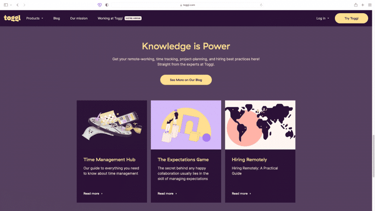
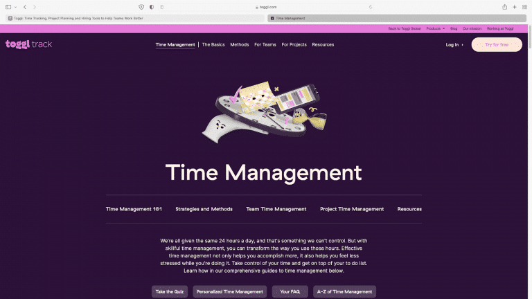
The team behind Toggl does a great job of developing strategic content. As you can see, they have successfully organized their content for every segment of their website visitors:
5. A carefully curated color palette
It’s human nature to associate a particular color with a mood or feeling. Every color visitors see will evoke a certain emotional response.
So, it’s important to pick the right color combination to represent your brand.
For example, if you’d like to position yourself as an edgy, innovative company, you might follow color trends that favor bold contrasts like red and black. Or, you could choose green, brown, and white if you intend to express your commitment to sustainability.
Take a look at the Banco De Brasil’s website brand colors below:
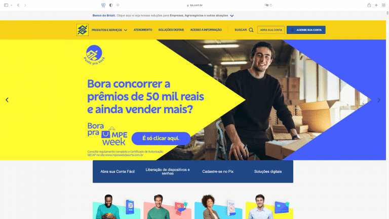
Yellow represents hope and optimism, blue is for trust, and green symbolizes the financial institution’s claim as the most sustainable bank in the world.
Once you’ve decided on your color scheme, consider how you’re going to integrate it into your website, including your blog, landing pages, headings, infographics, and background images.
6. A great user experience
Research shows that 88% of users are less likely to return to a website after a poor user experience.
As Kristen Baker writes, the user experience includes the customer’s perceptions, emotions, and responses to your website and offerings.
To help deliver a valuable and meaningful user experience, your website should be:
- Useful: Aim for original website content that fulfills a user’s need.
- Usable: Your site should be easy to navigate.
- Desirable: You should evoke emotion in your design elements.
- Searchable: Users should find it effortless to search for specific items on your site.
- Accessible: People with disabilities and limitations should be able to access and use your website.
- Credible: Your website content should be able to gain the trust of visitors.
Website personalization is an example of a UX best practice that brands can use. For example, once users land on your website, intuitive product recommendations will make them feel your site is specifically built for their needs and preferences.
Through personalization, each user sees a different version of the website for the same brand.
You can use the Hyperise editor to create personalized website assets to make your customers feel valued and create a lasting impression.
7. Consistency
If there is a lack of consistency in your branding website design, even the most eye-catching visuals, helpful content, and persuasive copy won’t make much of an impact.
An example of inconsistent brand elements would be your homepage having a footer, but the rest of your pages don’t include it.
Or your contact page copy sounds robotic, which contrasts with the punchy, conversational tone on your other pages.
One way to ensure consistency throughout your website and across all your channels is to develop a branding guide for your business. Help Scout’s visual elements brand guide and Mailchimp’s content style guide are stellar examples.
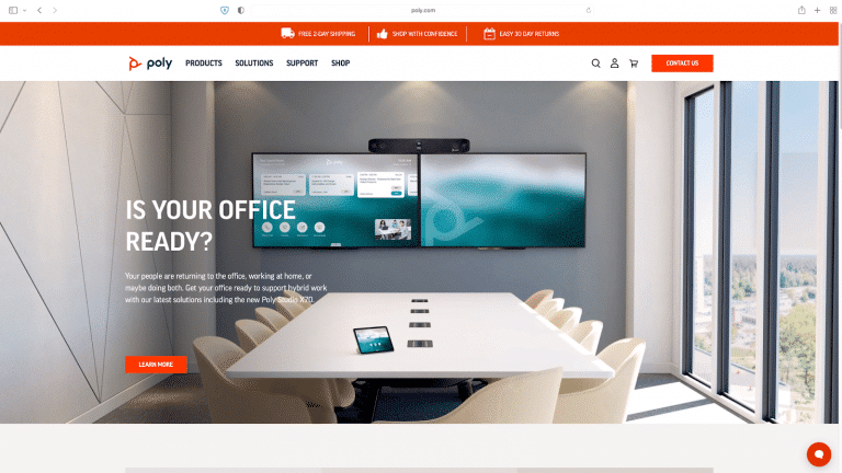
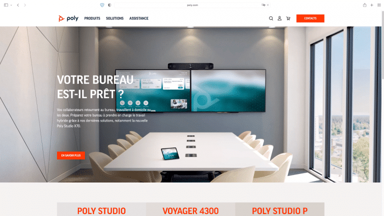
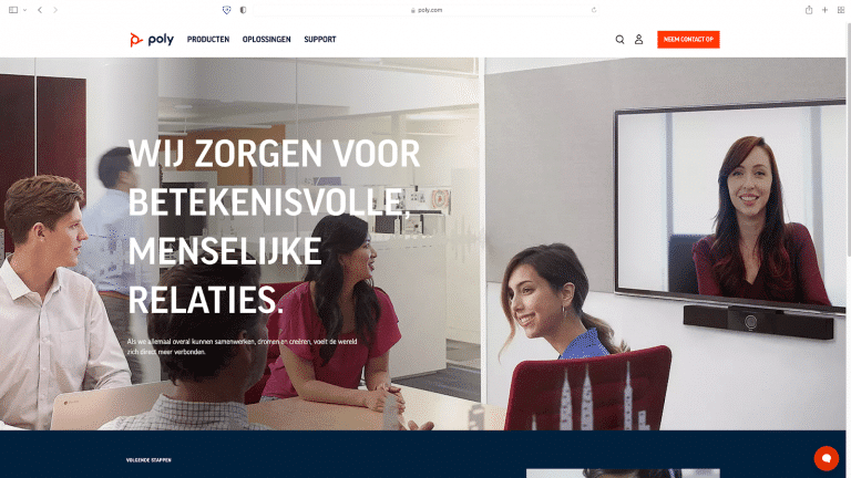
As you can see below, Poly does a great job of maintaining consistency throughout its website. They have implemented personalization by offering their website in multiple languages, tailored to the visitor’s location:
8. Strong calls to action (CTAs)
Around 70% of small businesses don’t have a CTA on their homepage. This is a missed opportunity.
There’s no use in designing a beautiful website if you don’t make it clear to visitors what they should do next.
Never assume that users can figure out for themselves what the next step is. Instead, include clear CTAs to encourage your audience to take action.
CTA buttons are an excellent way to achieve this. With Hyperise, you can personalize the CTA buttons on your website to deliver a tailored user experience.
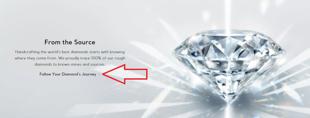
Here’s a good example of how Tiffany & Co are using a CTA to drive users to the next step:
Kickstart Your Website Branding Strategy with Hyperise
Now that you know what the essentials of successful branding are, it’s time to get started with your own website.
If you want to deliver an incredible user experience to your visitors and create a strong first impression, website personalization is a must.
With Hyperise, you can personalize the images, CTAs, GIFs, text, videos, and QR codes on your website based on each visitor. This helps to establish brand recognition and drives credibility and trust.
If you’d like to elevate your website branding and make a great first impression, sign up for a free trial of Hyperise and personalize your site assets without a single line of code.
Last Updated on November 5, 2025
